Please improve the UI/UX of the delete account page


Recently, I learnt that I owned two Medium accounts.
Medium account usernames
I haven't used Medium for quite some time, so having two accounts didn't make much sense. I thought of deleting the second account, whose username is @nvblog.
As per Medium, the following are the steps required for deleting an account on Desktop:
- On your homepage, click on your profile picture in the top-right corner and click Settings.
- Click Delete account at the bottom of the page.
- Confirm the action by entering your username.
Now, take a look at the 3rd point of the instructions above,
Confirm the action by entering your 'username'.
I logged into the @nvblog account and clicked on Delete Account.
Here's the screenshot of the pop-up that I received.
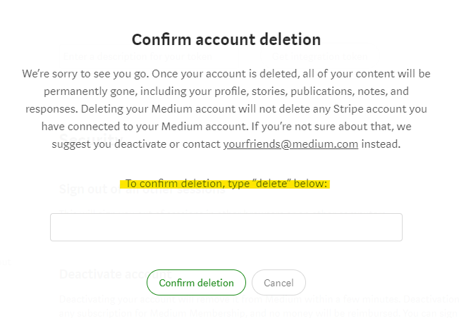
Did you notice the yellow highlighted section in the image?
To confirm deletion, type “delete” below:
Did you notice 'username' in the image above? No.
From the instructions, it looks like the Medium team knows better UI/UX behavior, yet they chose not to build such experience.
Humans tend to multi-task and there is a lot of room for manual errors while deleting an account. A good example is clearly narrated in the stardust article by Jakub Roztočil (Though this is about making the repo private). Jakub might need a lot of work to re-gain the 54k stars they have lost because of a single manual error. If Github had provided a good UI/UX, as suggested by Jakub in the article, manual error could have been prevented.
Platforms should clearly clarify which account the user is being deleted. It's important for the user to know if they are deleting the account or deleting an account.
Hopefully, this gets fixed by the Medium team.
Enjoyed this post?
Receive new blog posts directly to your inbox. Click to subscribe :)